InfrastructureDemo Wire
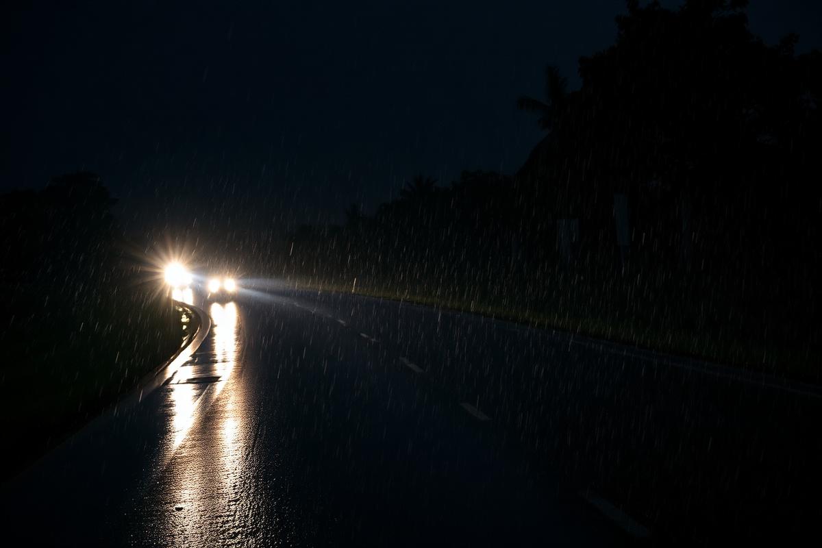
Demo placeholder: night-time corridor lighting pilot expands
Sample article slot describing a lighting intervention along a major highway corridor. Replace with a live feed item.
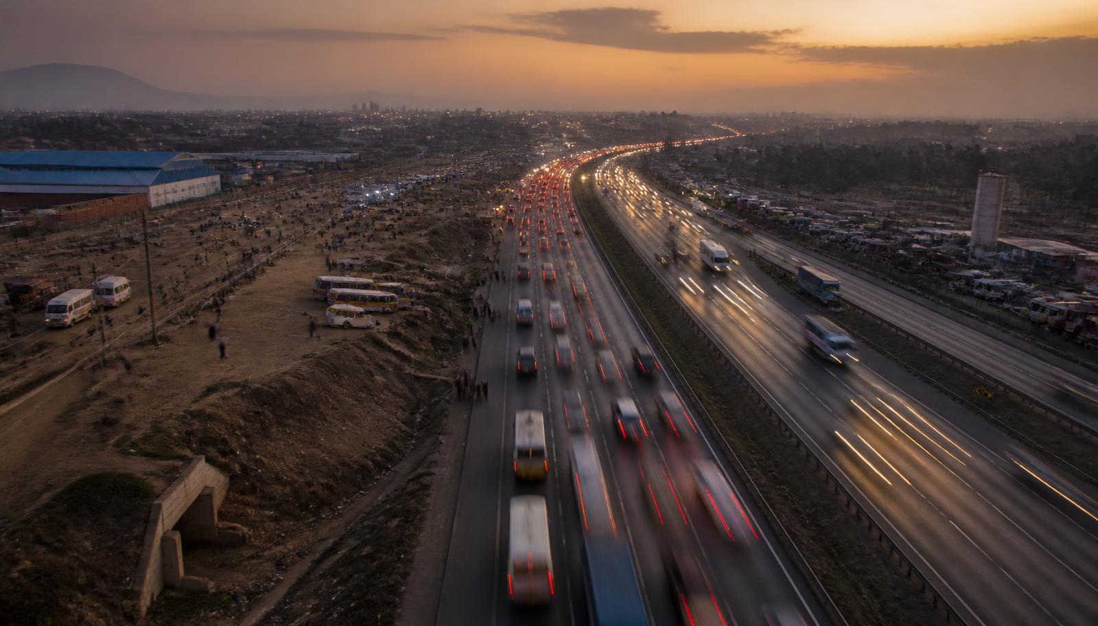
Understanding where, when and why lives are lost on Kenya's roads. This trial edition maps 1,370 demonstration crash records across all 47 counties, 8 highway corridors and 18 known blackspots.
Each card links to the visualization that produced it, so any claim can be traced back to the underlying records.
93 deaths across 174 crashes — driven by dense urban traffic and long trunk-road exposure.
Compare counties →4.29 deaths per 100,000 people. Absolute counts hide the risk carried by smaller counties.
See the rate map →People walking are the single most exposed group, most often struck while crossing unlit trunk roads at night.
Meet the victims →Crash volume peaks in the evening commute and again late at night on weekends — a narrow window where enforcement matters most.
Explore time patterns →Colour shows recorded deaths per county. Open the full map to switch to population-adjusted rates, pedestrian deaths, corridors and blackspots.
Click a county to focus it.
Drag the handles to brush a period.
An alluvial view of how vehicle type, driver behaviour and victim group flow into injury severity.
Hover a band to trace a single pathway.
Illustrative coverage cards showing how the data layer would sit alongside editorial reporting.
Sample article slot describing a lighting intervention along a major highway corridor. Replace with a live feed item.

Sample article slot summarising a protective-gear observation exercise in three towns.
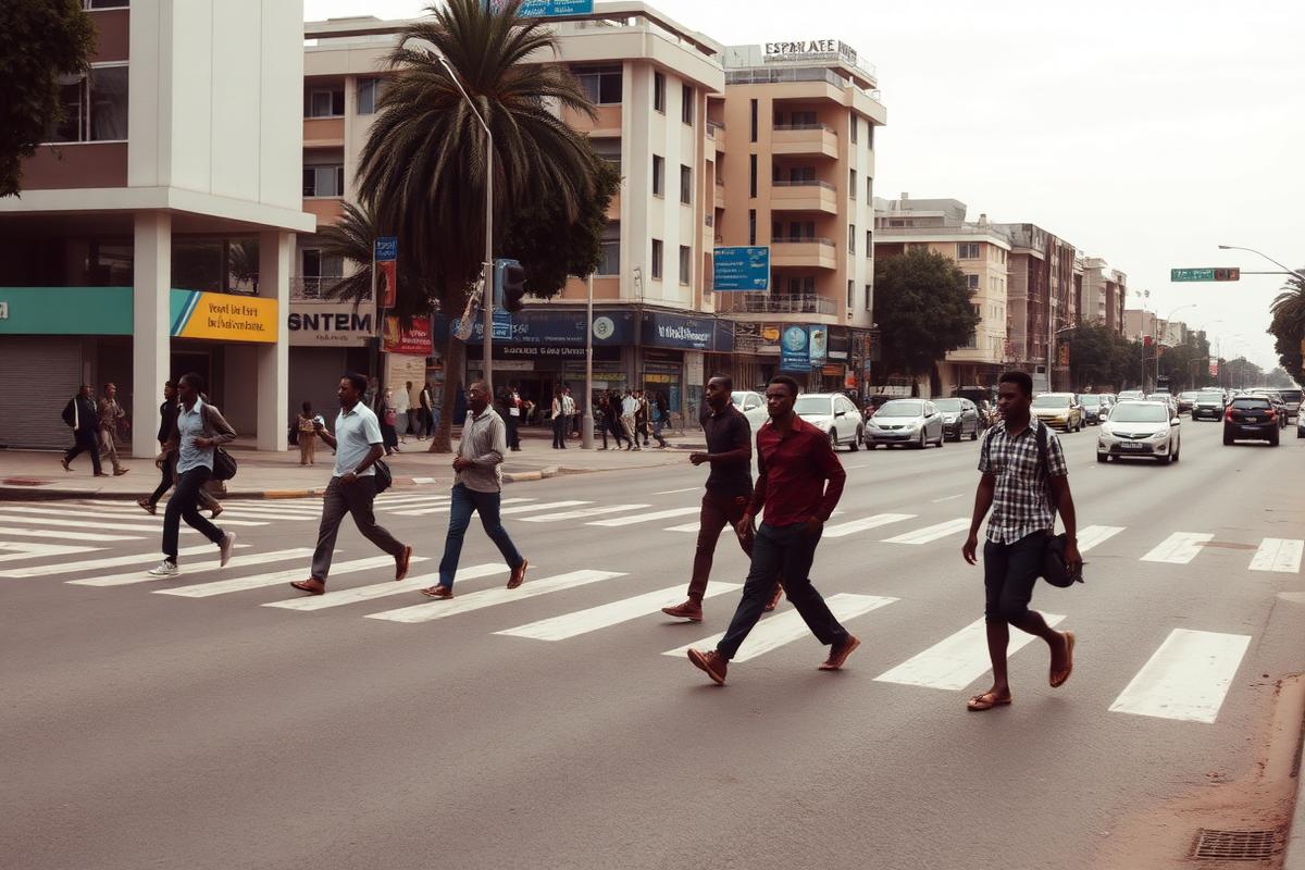
Sample article slot on proposed crossing redesigns near schools and market junctions.
All figures shown are temporary demonstration data generated for this prototype. They are not official Kenyan road-safety statistics.